Celebrating the colours of 2021
Pantone have picked not one, but two colours of the year for 2021, and they just so happen to be one of my favourite colour combinations - grey and yellow.
If you’re not familiar with Pantone colours here’s a little bit of an introduction.
In 1963 Pantone introduced the PANTONE MATCHING SYSTEM®, an innoviative tool which is now used across so many creative industries including textiles, apparel, beauty, interiors, architectural and industrial design. It consists of a library containing 10,000 colours across multiple materials including, most importantly for me - printing and textiles.
Pantone has been such a useful tool for me when choosing specific colours for bespoke projects. It helps avoid that tricky conversation of ‘I was thinking a really yellowy yellow’ or ‘a bluey grey would be great but not too dark’, in these situations Pantone offers a consistent reference which is invaluable in ensuring colours are correct and to the customers liking before a print goes into production.
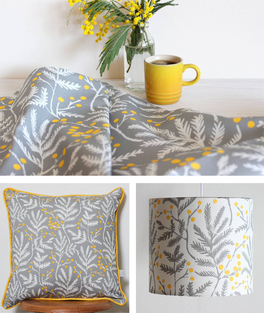
I find yellow such an uplifting and energising colour and I often enjoy using it alongside grey in my prints. I love the contrast of the calming grey with a bright pop of yellow, like I used in my Mimosa print below.
This print was inspired by the beautiful Mimosa tree growing in my Mum’s back garden, which bursts into a cloud of bright yellow pom pom like blossom early every Spring.
My Mimosa print is available across a range of Kitchen textiles, homewares and stationery in my online shop.
Yellow and grey often appear in my prints alongside other colours too, like gorgeous blues, oranges and reds. I like how the greys work to calm and subdue the brighter colours in the palette.
Nasturtium and Black Eyed Susan chair (upholstered by Button backed)
I’d love to know what your favourite colour combinations are so do get in touch and let me know and they might just pop up in a future Natalie Laura Ellen print!


